Alfiler Studio
- Web Design
Overview
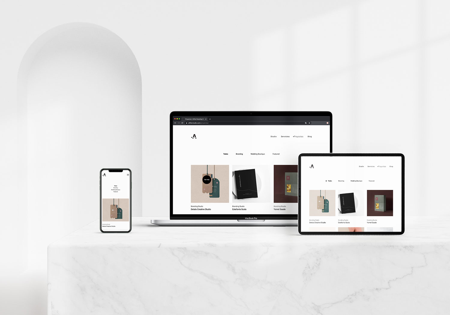
Alfiler is a Branding Studio located in Queretaro, Mexico. They were looking for a new website that could be faithful to their brand.
My role
Qualitative research, information architecture, web design, art direction, content creation, animation and interaction design, development supervision, and usability testing.
The Challenge
Redesign Alfiler's website for the 3rd time. As a studio that have had already two previous websites they didn't love, they had very specific requirements and high expectations.
Qualitative research.
To start the process, I had one briefing session and a 'understanding the brand' session with the design team, the owner, a couple of clients, and the person taking care of the website post-launching. I interviewed each of them to understand what was important, how could we make this website work in favor of the company, how might we make the setup process a lot easier and what aspects of the brand they saw misrepresented in the previous websites. They walked me through the brand and helped me to have a deep and clear understanding of their culture, values, aesthetics, and the kind of projects they wanted to win for the company.
Insights.
- Alfiler is a Spanish word for pin, they are tailors who design custom brands.
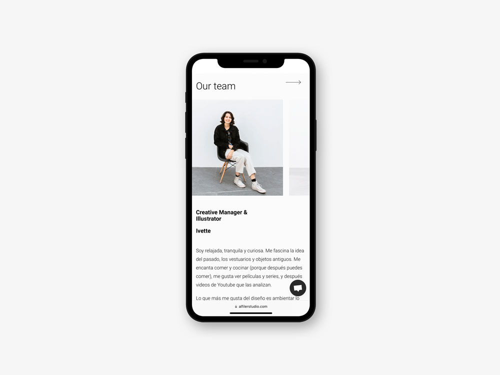
- Potential clients want to meet the team behind the agency in a human way.
- Be able to portray each project differently, as each one of them is unique.
- Have a simple and clear navigation.
- Keep website consistent and on brand.
- Guide them through best practices for them to keep it running smoothly.
Design Process
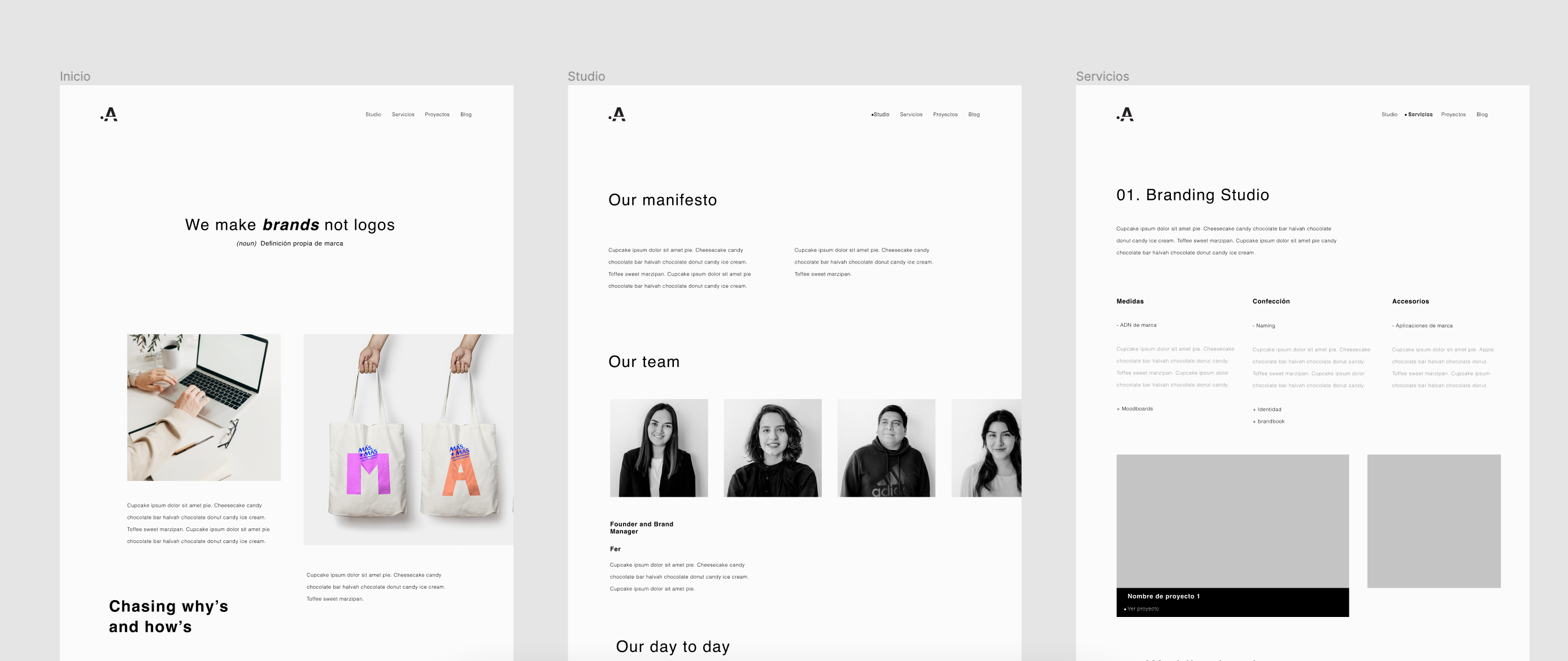
I started by mapping out all the information I had from research and started sketching and iterating. I like to set a time and sketch all the ideas in my head, take a break and then come back and see what is working and what is not.
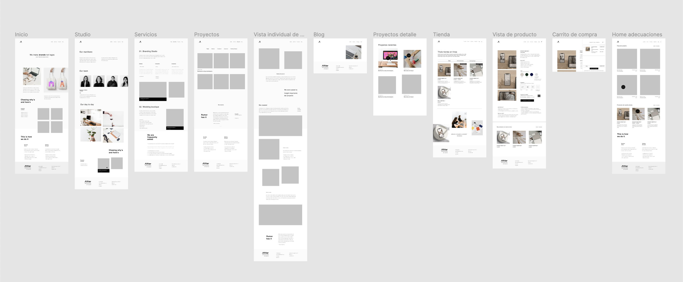
After some iteration, I went to Figma and did some wireframing and lo-fi prototyping to present a first proof to the company. Then, took their feedback and went back for some more iteration.
Design Decisions
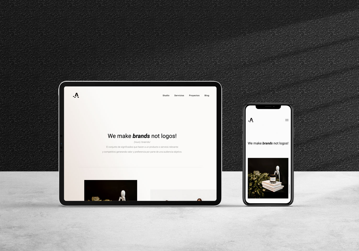
Alfiler's color palette has only two colors: black and white. I wanted to keep everything monochromatic but still have hints of color within a white spectrum for photography.
For the visual system, I put together colors, typography, buttons, iconography, and cards.
Some of the design decisions I took were:
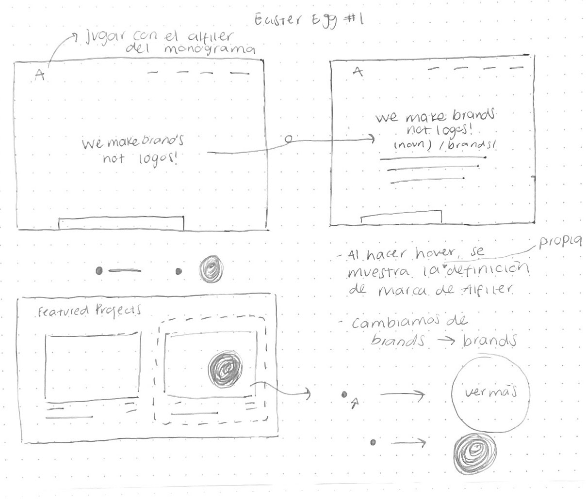
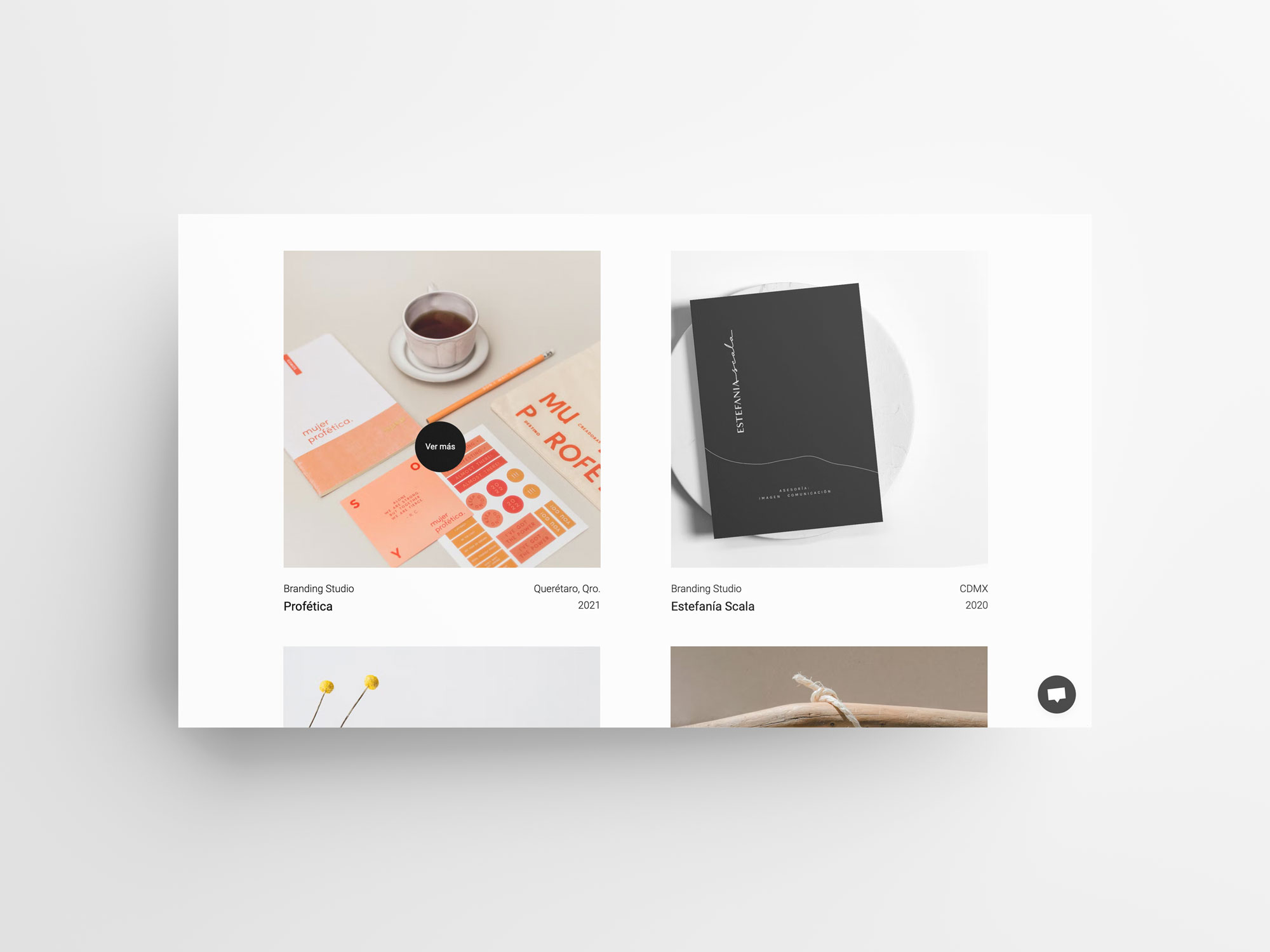
- Use the pin head as the pointer in the website and make it grow to become the button with a project area.
- Drop some easter eggs like the one on the home page where hovering over the branding word you get the studio's own definition.
- For the individual project page, I designed blocks of content that could potentitially move around, and that way they could decide which blocks they wanted to use for each project so that each of the could be unique.
- Since they didn't want a contact form, I had to reconsider the original navigation and went ahead with a chat instead.
- Designed some interactions and animations to provide instant feedback and help the users know their actions will do what they expect them to do.
Coding, creating content for setup and launch.
I started by mapping out all the information I had from research and started sketching and iterating. I like to set a time and sketch all the ideas in my head, take a break and then come back and see what is working and what is not.
Once we went into the coding stage, I worked very closely with the developer to make sure the outcome was as expected and that the little details were kept through design, navigation and interactions. We decided to have Prismic as the CMS as it is super simple to use. Once this stage was ready, I created the visual content we needed and set it up.
Final Thoughts
Creating a website for Alfiler was a process I enjoyed because I had the opportunity to work very closely with all the parts involved. I feel that after the qualitative research I had a very clear vision of what I wanted to create. Although many things changed throughout the process, I think the essence of Alfiler's brand was kept and projected.
Three years later the website is still up and running.
Three years later the website is still up and running.
