Designing clarity at Apple
Three years of making complex internal tools easier to use.
When I joined Apple, our design team of three set ourselves an ambition: to bring the same care and design rigor associated with Apple’s customer experiences to the internal applications we supported.
These tools helped employees do their everyday work. Yet many had evolved without a dedicated UX process. Complex workflows, unclear information, and inconsistent interfaces left people confused and frustrated, often using the tools only when necessary.
Our opportunity was to make those experiences clearer, more intuitive, and more useful.
Working through complexity
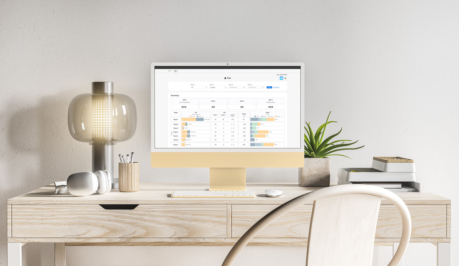
Over three years, I designed internal experiences across Finance, Sales, People, and Compliance, spanning web applications, websites, and data visualization dashboards.
I redesigned multiple applications and designed three of the largest and most complex platforms within my organization from the ground up. My daily work involved translating highly technical information, ambiguous requirements, and interconnected workflows into experiences people could navigate with confidence.
Clarity required understanding the logic behind the interface: what people needed to accomplish, which information mattered at each step, and where uncertainty or mistakes could arise.
Connecting business, data, and design
I frequently served as the sole designer responsible for a project from initial discovery through implementation, working closely with business stakeholders, data analysts, and software engineers.
Technical briefs were the starting point. Through conversations and iterative exploration, I helped turn requirements into a shared understanding of the problem and a clear direction for the experience.
This meant balancing different perspectives, questioning assumptions, and working through exceptions alongside the main workflow. Design became a way to help teams make decisions together.
Making clarity visible
The visual work carried that thinking into the interface. Information hierarchy, interaction patterns, and carefully considered layouts helped reduce cognitive load and make complex tasks easier to follow.
Along the way, I created new components for the internal design ecosystem, extending its visual language to support needs that existing patterns did not yet address.
My goal was to create interfaces that felt coherent with Apple’s visual standards and comfortable to use, allowing people to focus their attention on their work.
How the experience shaped me
Working at Apple expanded my understanding of UX/UI design and strengthened my critical and strategic thinking.
It shaped a mindset I now bring to every project: organize the information, identify patterns, explore the variables, and anticipate where people might need support. Then use that understanding to decide what deserves emphasis and what can be simplified.
That thinking gives the visual work its purpose. I want an experience to feel considered and enjoyable, with enough clarity that the interface becomes almost invisible to the person using it.
The most lasting lesson was the responsibility behind simplicity. An experience that feels effortless often depends on carefully resolving a great deal of complexity.
I worked at Apple for three years as a UX/UI designer through contracting partners. This reflection describes my approach and responsibilities in general terms. Project details and visuals remain confidential.